Hbcc
First Time for Everything
Brand Identity
Merch Design
Conceptual
Brand Identity Merch Design Conceptual

Overview
The Horton Bay Cup Championship (HBCC) is a golf tournament founded in the mid-90s, and enshrined with a trophy for the winner in 2005. A group of select men have played in this tournament, via invite-only, and have held this event every year in mid-July.
Branding has never existed for the tournament, only a picture of one of the founders on the trophy to symbolize the event and the triumph of taking home the cup. Sadly, this founder has since left us but has been forever immortalized on the trophy, and now in the branding.
Services
Brand Identity
Merch Design
Conceptual
Personality
Classic
Lively
Athletic
RESEARCHDeep Dive Into Other Events.
As stated, HBCC has never had any formal branding or logomark so the only history to go off of is their trophy with a metal plaque including a picture of one of the founders on it. So existing imagery or callbacks are limited/non-existent. Let’s look further then; dive into what other golf tournaments have done, as well as some popular golf brands around the country.
Symbolism for these tournaments vary in style from clean, modern typography to classic serif and slab-serif marks, often paired with course-specific iconography. However, something interesting that I found is that a lot of tournaments still use their original marks offering a unique opportunity to branch beyond your typical 2020’s sans-serif logomarks.
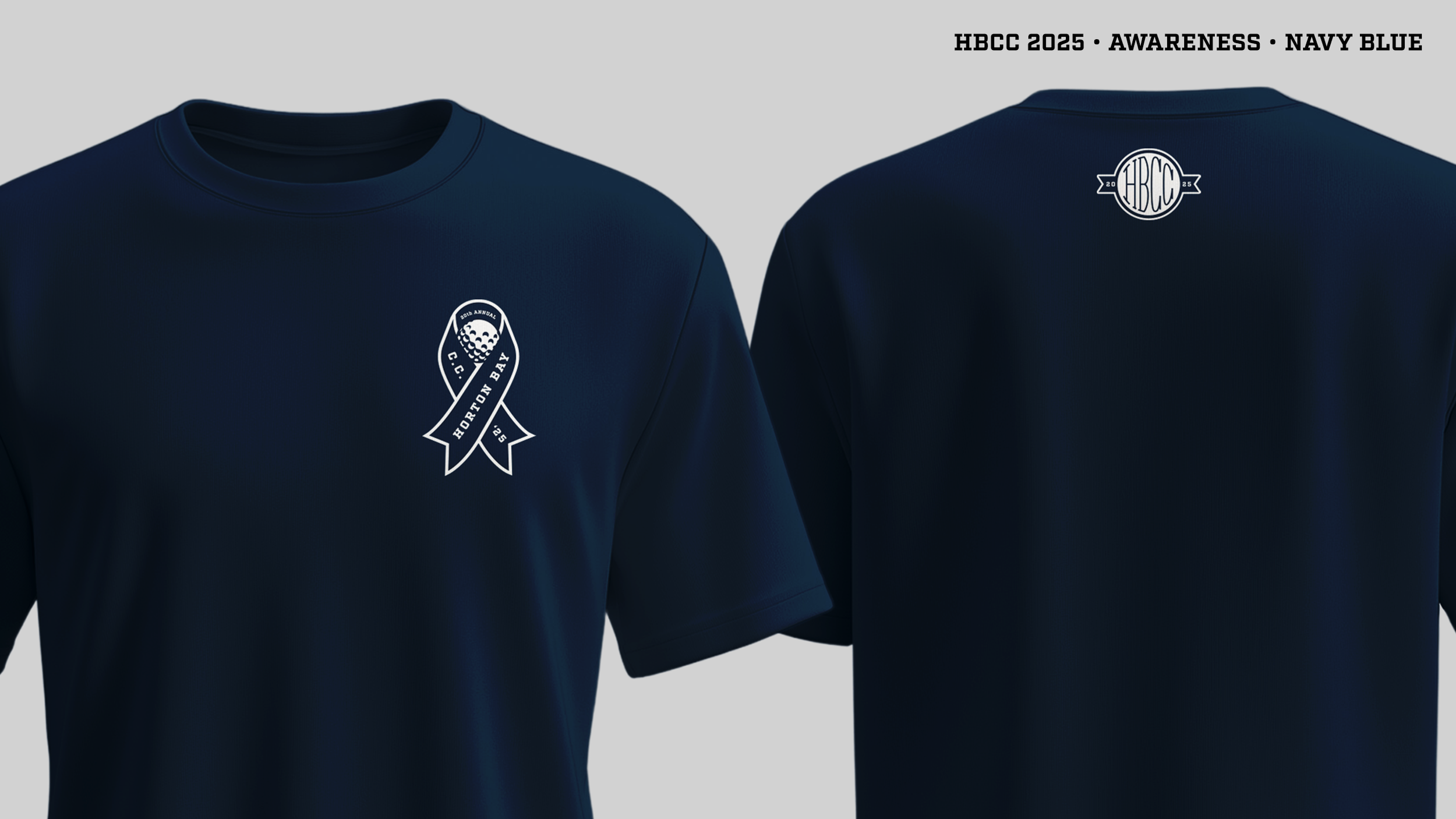
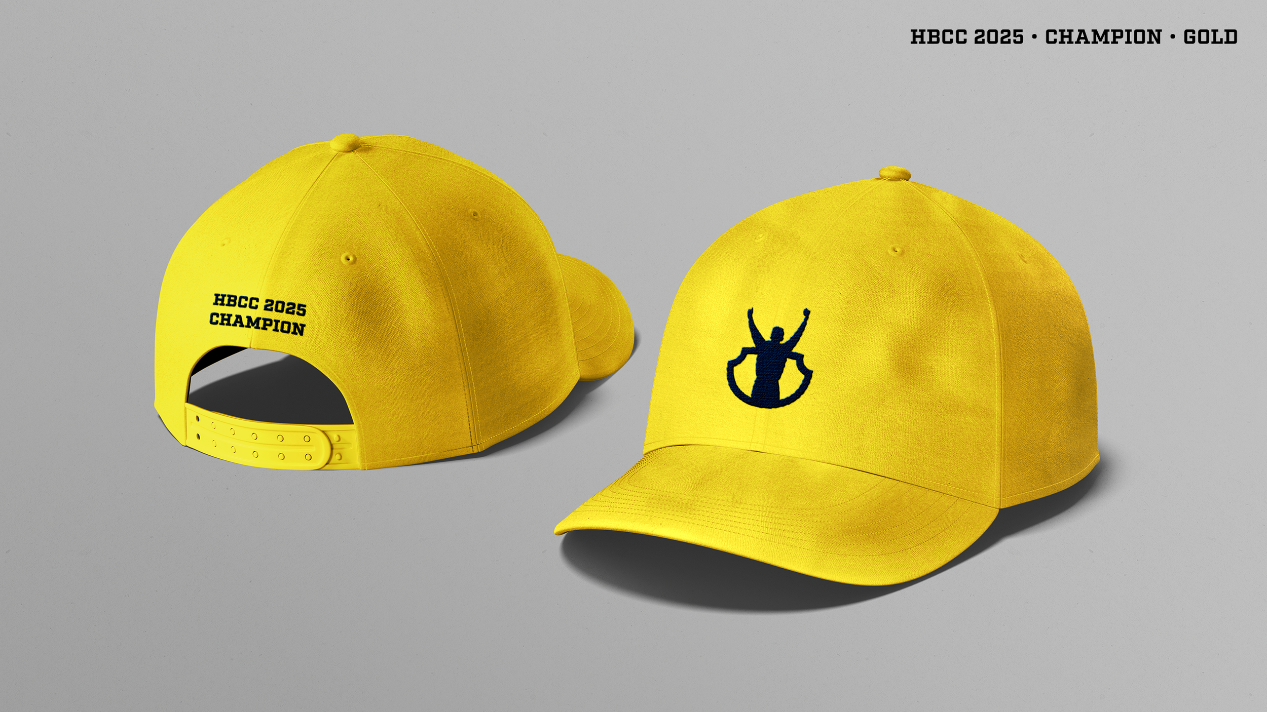
MERCH DESIGNSTradition + Flair.
Everyone wants to rep their favorite brands, well for this tournament, I’ve created a line of merch options to fit the brand, but allow the participating players some wiggle room to express themselves in how they might want to showcase their style and swag.